
This is an update of an article originally written in April 2014.
Typography complements and drives a strong design.
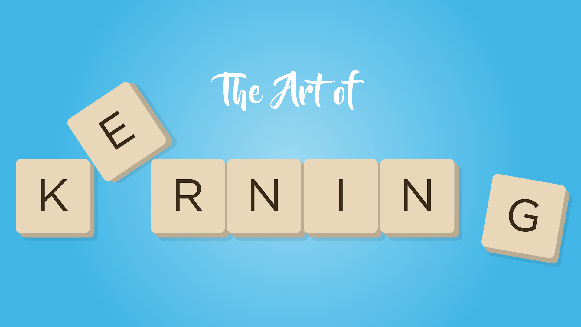
Good typography can be lost by the lack of attention given to kerning. It is an art that has gotten lost in the digital age or ignored for whatever reason for many years.
Real quick, what is Kerning?
Kerning is adjusting the space between individual letter characters of a word to increase the legibility and readability of the content. More on this below…
Back in early days of design and print production, you would get type from a typesetter, run it through the waxer, cut blocks of type with a tee square, triangle & xacto knife and then position it on the artboard. We would kern our headlines by using an xacto knife to cut between the letters of the word and tighten up the lettering. It was a painful process that needed to be done.
In terms of print design, the ability to precisely control type in todays applications leaves no excuse for poorly kerned type. Our favorite phrase when encountering poorly kerned type is “you could drive a truck between those letters”. Quality font designers take kerning into consideration with each and every letter in an attempt to ensure that letter spacing looks good from the get-go of typing out words.
Pro Tip: Not sure if your kerning is right? Print off your item in question and turn it upside down. Most times glaring gaps will become noticeable.
More and more people are quickly and cheaply developing fonts focusing on the overall look of the font and disregarding things like kerning. It’s something to be aware of when downloading fonts from free online resources. In other words, you may get what you pay for.
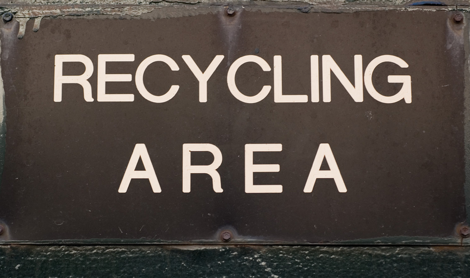
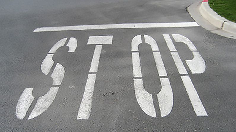
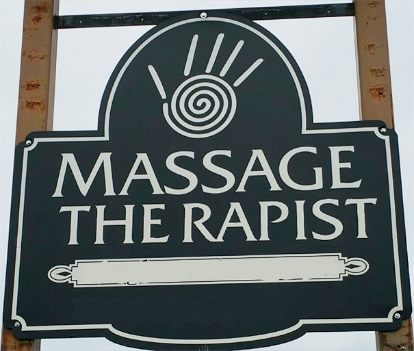
Just a few examples of poorly kerned type.
For the web, controlling individual letter spacing is tough; however, online resources like Google and Adobe have vastly expanded the font choices available to web designers. While a majority of these fonts are kerned well, you can can still run into instances of poor spacing so be aware.

Here are a few things that will help you understand and improve your eye for kerning type.
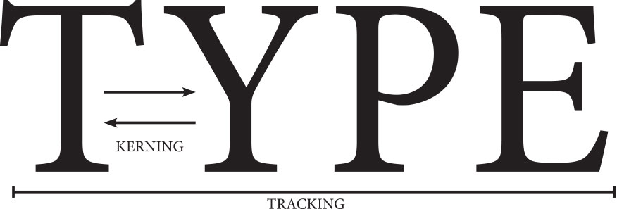
Is it kerning, or tracking?
In its simplest form, kerning is adjusting the space between two individual letters, while tracking is adjusting the spacing uniformly over a given selection of text. The goal for both is to equalize the appearance of the whitespace between letters. This can get tricky because you really have to develop an eye for it.
Sometimes the whitespace between letters won’t look uniform, and you have to fine tune the individual letters until the word looks like you think it should. And someone else may see it different yet. There’s really no magic formula; you just have to eyeball it and decide what looks right to you.
Understanding Types of Kerning
There are three types of kerning: no kerning at all, automatic kerning, and manual kerning. No kerning is obvious. Automatic kerning is the kerning applied automatically by a program like InDesign. Manual kerning is applied by the user manually.
There are two types of automatic kerning, metric and optical. With metric kerning, the program uses directly the values found in the kerning table(s) included in the font file that the type designers specify. Optical kerning, is available only in the more advanced systems.
In manual kerning, which is available in some systems, the designer is able to override the automatic kerning and apply whatever kerning value the designer wants directly to a pair of characters in the text. When manual kerning is not an option for two characters, I fake it by using tracking. When you know what you’re looking for manual kerning is the way to go.
Letters & Numbers to Watch Out For!
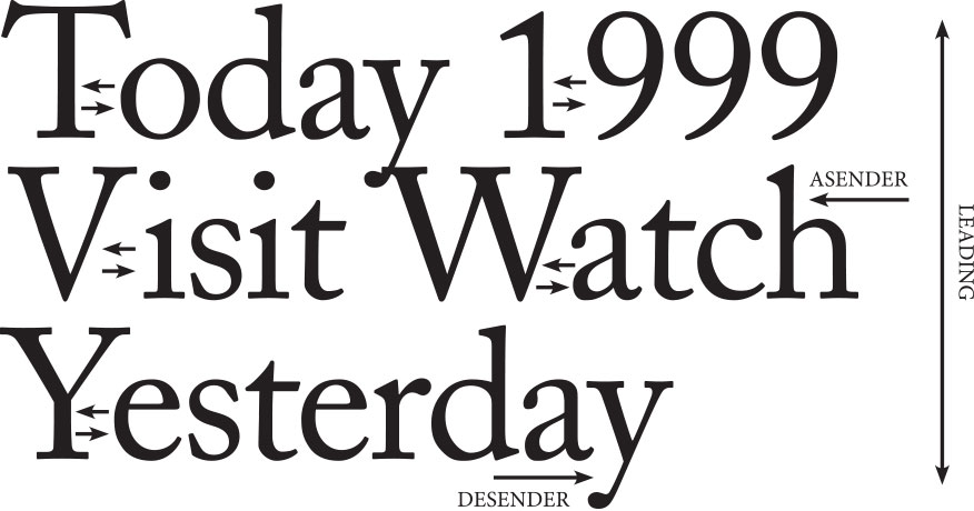
As your eye develops a knack for kerning, you will start to notice that certain letters are more problematic than others. The capital letters T, V, W, and Y need more attention than most of the others. The number 1 always seems to cause problems whenever used in phone numbers, years, prices etc…
What about Leading?
Now, to add even more confusion to this equation, we’ll throw leading into the mix. Leading (“led-ing”) is the vertical space between lines of type. Leading becomes an issue when you are dealing with ascenders & descenders. Try to adjust leading (or “line-height” on the web) to avoid certain letters from touching, and so that they look visually appealing.
Conclusion
Hopefully you have gotten something from this discussion. Kerning isn’t the most difficult thing you’ll do in design, in fact, it is relatively easy. So easy, that it often gets overlooked.
Try to always keep kerning in your thoughts and to always inspect your letter spacing especially with logos, signage, and headlines. By spending a few minutes kerning, you will notice a huge improvement on the overall look and feel of your final product.
Want to test your kerning skills?
Try out this website, Kern Type. It’s a kerning game, which is a fun and great way to help you see what kerning is, and how it works.
Learn more about typography:

We work with businesses that are not afraid to take the next step.
Let’s put your marketing and website to work.