
We get requests to build dashboards all the time, but sometimes what clients actually need is a periodic report. The terms get used interchangeably, but they serve different purposes. Understanding the distinction helps you pick the right tool for the job and avoid building something that looks impressive but doesn’t actually solve your problem.
What is a Dashboard?
Think about your car’s dashboard. You glance down and instantly know your speed, fuel level, RPMs, and whether that check engine light is glaring at you. All of that information registers in seconds because it’s designed for at-a-glance understanding.
Business dashboards work the same way. They give you a snapshot of what’s happening right now with your business, website, sales, or operations. A good dashboard fits on a single screen and displays key performance indicators that you can understand without having to think too hard about what they mean.
The data on a dashboard should be quantitative and easily understood. Bar charts showing growth or decline, dials indicating server load, sales projections versus actual results. If a metric needs extensive analysis or explanation to make sense, it probably doesn’t belong on a dashboard.
Dashboards work well for monitoring servers, tracking e-commerce activity, watching stock prices, keeping tabs on cryptocurrency portfolios, or managing calendar events. Anything where you need immediate awareness of current state.
What is a Report?
Reports dig deeper. They analyze data over time, explore trends, test hypotheses, and provide context that helps you understand not just what happened, but why it matters and what you should do about it.
Most reports are tied to a specific timeframe—weekly, monthly, quarterly, yearly. They’re usually multipage documents that describe the state of your data and offer analysis. While dashboards show you the check engine light, reports are what you get when you plug in the code reader at the mechanic’s shop and figure out what’s actually wrong.
Reports take longer to generate and often require human thought and interpretation. They work hand-in-hand with dashboards. The dashboard alerts you to something worth investigating, and the report provides the analysis to act on it.
The Rise of AI-Powered Dashboards
Dashboards have evolved considerably in 2025. Static displays showing yesterday’s numbers are giving way to intelligent systems that don’t just report what happened—they predict what’s coming and suggest what to do about it.
Research from Gartner indicates that 90% of business leaders will depend on AI-generated insights by 2025, and that shift is changing how dashboards function. Modern AI-powered dashboards can detect anomalies automatically, forecast trends based on historical patterns, and surface insights that might otherwise go unnoticed in the data.
The big change is natural language querying. Instead of clicking through filters and dropdown menus, you can ask your dashboard a question in plain English. “Why did returns spike last month?” or “Which product categories are underperforming this quarter?” The system interprets your question, analyzes the relevant data, and presents the answer with supporting visualizations.
This makes dashboards accessible to people who aren’t data analysts. You no longer need to know SQL or understand complex query structures to get the information you need. These AI-powered dashboards are becoming collaborative copilots for decision-making rather than just static reporting tools.
Predictive analytics is another capability that’s moved from niche to standard. Dashboards can now project future performance based on current trends, flag potential problems before they become critical, and recommend specific actions based on what worked in similar situations previously.
Real-Time Data Streaming Changes Everything
The other major shift in 2025 is the move toward true real-time data. Traditional dashboards relied on scheduled data refreshes—hourly, daily, or at best every 15 minutes. That worked fine when you were reviewing yesterday’s sales numbers, but it’s insufficient when you need to react to what’s happening right now.
Real-time streaming dashboards update as events occur. If a server goes down, you see it within seconds, not at the next scheduled refresh. If a marketing campaign suddenly drives a spike in traffic, you know about it immediately. If a supply chain delay impacts inventory levels, the dashboard reflects it the moment the data changes in your source systems.
This real-time capability matters most for operational decisions. Monitoring system performance, tracking customer service response times, managing inventory during high-demand periods, or adjusting pricing based on live market conditions. These scenarios benefit from instant data visibility rather than periodic snapshots.
The technology enabling this shift includes event streaming platforms that capture data as it’s generated, process it on the fly, and push updates to dashboards continuously. Modern platforms unify streaming and batch data processing into single architectures that can handle both real-time operational intelligence and historical analysis.
For most businesses, you don’t need every metric to update in real time. Strategic decisions still benefit from periodic reports that provide context and analysis. The key is matching the refresh rate to how the information gets used.
The Dashboard/Report Hybrid
In practice, most organizations need both approaches. We’ve built hybrid systems that dedicate screen space to dashboard-level metrics but allow users to drill down into detailed reports or apply filters for deeper analysis.
This is common with SEO and advertising measurement. You want the dashboard view showing current rankings, traffic trends, and campaign spend at a glance. But you also need the ability to export monthly reports that compare results across time periods, analyze which content performed best, or calculate ROI by channel.
The hybrid approach means your snapshot view and your analytical tools live in the same system. You’re not jumping between platforms or reconciling data from different sources.
Dashboards Are All Around Us
You encounter dashboard-style data constantly without realizing it. Eppley Airfield displays real-time parking availability and TSA wait times directly on their homepage. Sports websites show live game scores and stats. Weather apps give you current conditions, hourly forecasts, and radar—all dashboard components designed for quick scanning.

Dashboards Aren’t Just for Business
The dashboard concept applies anywhere you need to monitor multiple data points. Smart home systems often use tablet displays that function as household dashboards—lighting controls, family calendar, countdown timers to upcoming events, grocery lists, weather forecasts.
Most people have turned their phone’s home screen into a personal dashboard using widgets. Calendar appointments, weather radar, news headlines, fitness stats, and whatever else matters to them arranged for at-a-glance viewing throughout the day.
What Do You Need to Measure?
Every business has metrics worth tracking. The question is whether you need a dashboard, a report, or both. Here are examples of the kind of dashboards we commonly build for clients. Some information has been redacted for confidentiality.

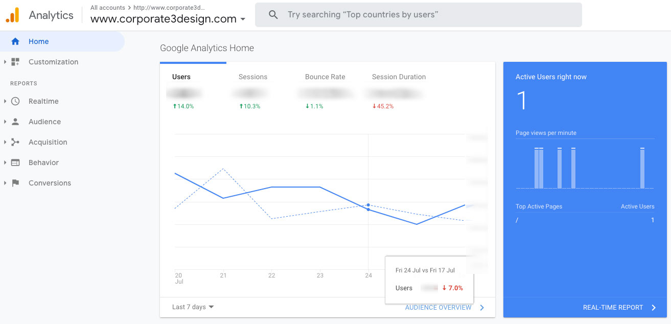
Organic Search Dashboard
This dashboard tracks website traffic from search engines. It shows key metrics like total sessions, page views, bounce rate, and how visitors found the site. The data helps identify which acquisition channels drive the most traffic and whether that traffic engages with the content or bounces immediately.

AdWords Campaign Dashboard
Advertising campaign dashboards display real-time performance across paid search campaigns. You can see total spend, cost per click, click-through rates, and conversion metrics. This allows for quick budget adjustments when campaigns underperform or need scaling when they’re delivering strong results.

Data Center Uptime Dashboard
Infrastructure monitoring dashboards show the health of servers and services. This example displays uptime status, response times, and historical performance data. The green indicators show all services are operational. When something fails, the visual change is immediate and obvious.
Looking Ahead to 2026
Dashboard technology continues to advance. Industry projections suggest that by 2026, 75% of enterprise dashboards will integrate AI for proactive insights, and the percentage of dashboards built with mobile-first design principles will dominate new deployments.
We’re also seeing increased emphasis on explainable AI. It’s not enough for a dashboard to tell you something is wrong or make a recommendation. Users need to understand why the AI reached that conclusion and what data informed its suggestion. Transparency in AI decision-making builds trust and makes the insights more actionable.
The evolution toward conversational interfaces will continue. Dashboards that respond to natural language questions, remember context from previous queries, and adapt their visualizations based on user behavior are becoming standard rather than experimental.
Real-time capabilities will expand beyond just operational metrics. More strategic planning will incorporate live data feeds, allowing executives to adjust course mid-quarter rather than waiting for periodic reports to identify problems or opportunities.
Resources for Building Dashboards
If you’re exploring dashboard tools for your organization, here are some platforms worth researching:
- Tableau – https://www.tableau.com – Enterprise-focused data visualization with robust analytics capabilities
- Power BI – https://powerbi.microsoft.com – Microsoft’s business intelligence platform with strong Excel integration
- Looker Studios – https://cloud.google.com/looker – Google’s BI and analytics platform for enterprise data exploration
- Grafana – https://grafana.com – Open-source platform for monitoring and observability, particularly strong for technical metrics
- Geckoboard – https://www.geckoboard.com – Simplified dashboard tool designed for displaying KPIs on office screens
- Metabase – https://www.metabase.com – Open-source business intelligence tool with an intuitive interface
Each platform has different strengths depending on your data sources, technical requirements, and how you plan to use the dashboards. Most offer free trials or limited free tiers so you can test them before committing.
FAQs
It depends on how the data gets used. Real-time updates make sense for operational metrics like server uptime, customer service queues, or live sales activity. Strategic metrics like monthly revenue or quarterly growth work fine with daily or weekly refreshes. Match the update frequency to how quickly you need to respond to changes in the data.
Not anymore. Modern dashboard platforms offer drag-and-drop interfaces and pre-built templates that work without coding. AI-powered tools with natural language querying let you ask questions in plain English rather than writing database queries. Complex custom dashboards still benefit from technical expertise, but basic dashboards are accessible to non-technical users.
Traditional dashboards display what happened based on historical data. AI-powered dashboards analyze patterns, predict future trends, detect anomalies automatically, and recommend specific actions. They can answer questions like “why did this metric change?” rather than just showing you that it changed. The AI acts as a decision-making partner instead of just a reporting tool.
No. Dashboards excel at monitoring current state and triggering alerts when metrics change. Reports provide the context, analysis, and recommendations needed to understand why something happened and what to do about it. Most organizations need both—dashboards for awareness and reports for decision-making.
Putting too much information on the screen. A dashboard crammed with 30 different metrics defeats the purpose of at-a-glance understanding. Focus on the 5-7 metrics that actually matter for the decisions you need to make. If something requires explanation or deeper analysis to be useful, it belongs in a report, not on the dashboard.