
While it is certainly more work to create a fully responsive web site, your business will ultimately reap the benefits by offering your customers access to a faster, well-designed site that is easier to use wherever their devices follow them.
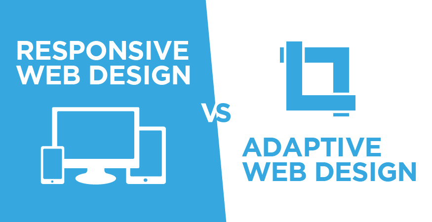
What’s the difference between Responsive Web Design and Adaptive Web Design?
Responsive Web Design is built on a single, highly flexible, fluid grid layout. How can you tell? Reducing the size of your browser window will cause the page content to flow downward and scale smoothly, wrapping text and adjusting images as needed.
Adaptive Web Design requires multiple layouts to be created on fixed grids, specific to screen pixel sizes that serve as breakpoints. How can you tell? The breakpoints will be noticeable in a browser. Adaptive sites won’t scale down smoothly as you adjust your browser window like on a responsive site.
Why Choose Responsive Design?
With the growing number and variety of connected devices, there are fewer and fewer standards concerning universal screen sizes or ideal breakpoints. Responsive design will always offer the best possible user experience to your customers regardless of screen sizes or network speeds.
Additionally, having a responsive site could mean better mobile search visibility.
Google rolled out a new ranking algorithm beginning April 21, 2015 for mobile search results that actually favors sites that are properly optimized for mobile users. If you’re really not sure if Google thinks your site is “mobile-friendly” or not, visit this test page to find out.
Tips for Taking on Responsive Design
Assign a Hierarchy to Your Elements
Meet with your designers and developers to decide which elements are most important in creating an engaging user experience on your site. Chances are your mobile site will look very different from larger designs, or vice-versa.
Make the Shift from Pixels to Percentages
Encourage your developers to avoid using fixed pixel values. Percentages are relative units that make sense regardless of a device’s screen size.
Design for Mobile First
Delivering your customers a beautiful responsive site is far easier when you start by designing for devices with the least amount of real estate. As the screen size grows, it will be obvious where to place additional elements not fit for the mobile experience. This method also decreases the time needed for your developers to build the site, making it a win-win for everyone.
Are you in need of a brand refresh or complete overhaul? Improve the quality and impact of your online marketing with the power of custom web design.