

Landing pages can entice prospective customers by providing an attractive offer in exchange for information.
On average, you have less than 10 seconds to grab the attention of a member of your online audience, so don’t clutter your landing page with endless content.
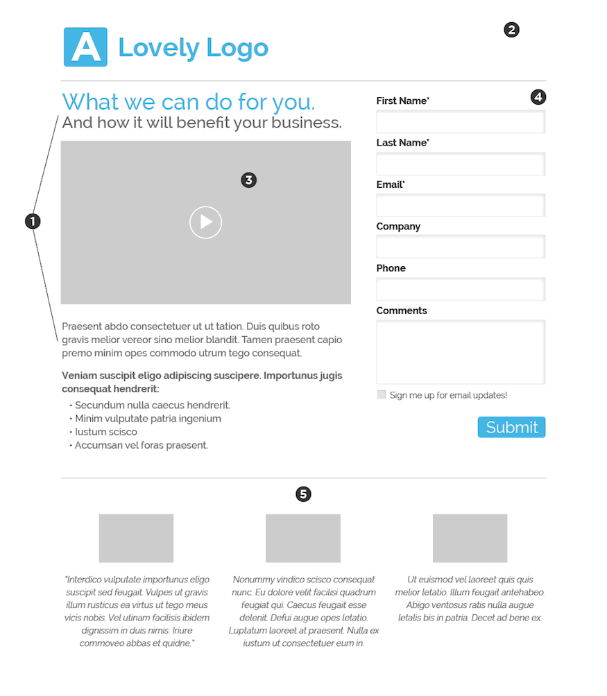
If the idea of creating landing pages has you worried, do not fear! Below are six key steps to creating effective landing pages, along with a diagram showing potential placement for those must-have elements.
Define Your Call to Action
The call to action catches a prospective customer’s attention to force a transaction, such as a name and email in exchange for a white paper or case study. Rehashing freely available information often isn’t an attractive offer. Make sure your offer adds value and to identify it clearly in your CTA. Strive for consistency throughout the lead generation process by making sure the information provided on the page matches what they previously read or clicked. Landing pages are NOT meant to mirror your generic contact form. They are developed to turn possible prospects into thriving clients by highlighting your unique solution to a specific want or need.
Remove Other Choices
Additional navigation on a landing page gives your prospect an opportunity to leave your landing page and forget what you are offering. Don’t clutter a page with links or content not pertinent to your offer. After they submit your form, then you can provide links to additional information on your full website on the thank you page or email.
Use Visuals
A supporting image or video can do a lot of selling for you. If I can see it, I am more likely to believe in what I am buying. If you are using a video, use reasonable lengths, especially if it is either narrative to purpose of the landing page, or showing key benefits. Longer form video actually works surprisingly well, depending on your offer. If budgets allow, make sure the video contains the call-to-action dedicated to the page. And if embedding YouTube videos, make sure to turn off related videos at the end of play to keep the focus on the offer at hand.
Make It Easy
The best way to gather information about your potential customer is via a web form. This ensures that the information submitted will be saved into a database and not get lost in the shuffle of endless post-it-notes sitting on your staff’s desk. When using a form, ask only for the information that is absolutely necessary. Additional information can be gathered via follow up communications with that potential client.
Show Evidence & Support
Meaningful testimonials, logos or statistics from previous clients are great proof elements that build trust and show that what you have done has worked for others. Just don’t over do and clutter the page.
Measure, Track, and Improve
A landing page shouldn’t be set in stone. Test different headlines, form fields, CTA’s, and compare results using videos vs. images. The more you test, the more you learn the characteristics of your audience and can craft more efficient and effective offers.
What if I want more?
These are just the basic elements of an effective landing page—of course there are exceptions to the rule.
Landing pages like the one for Adobe’s new product, Project Comet, may at first view appear to break the rules, but in review, all the necessary items for an effective page are still present.
The only item I would like to see them change is to remove the main navigation at the top right of the page to keep prospects from leaving this lander and forgetting about their offer. Other than that, clear descriptions and headlines, engaging imagery and simple call to action make this a successful product landing page.
Are you in need of a website overhaul or complete redesign? Improve the quality and impact of your online marketing with the power of custom design.