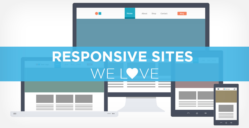
Responsive design accommodates users on all devices. If you are in need of some inspiration for your next mobile-friendly layout, check out some of our favorite responsive sites here.
Bad Assembly

VISIT SITE
Bad Assembly doesn’t mess around. Rather than discourage visitors with a non-optimal viewing experience, they actually alert users to turn their devices to portrait mode when needed to view the site.
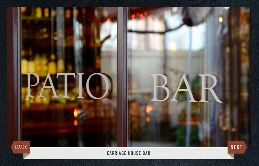
Moonshine Patio Bar & Grill
VISIT SITE
My favorite aspect of this site is the arrows that control the main promo rotator. As you resize your browser, the arrows shift to become a banner that displays under the photo with the image title. They also do a nice job providing a responsive menu, unlike most sites that will just display a link to a pdf.
Indochino Custom MenSWear

VISIT SITE
Think about what visitors will be going to the site for based on their device. Watch as the 3 sub promos keep scaling based on screen size then eventually collapse and display as product categories.
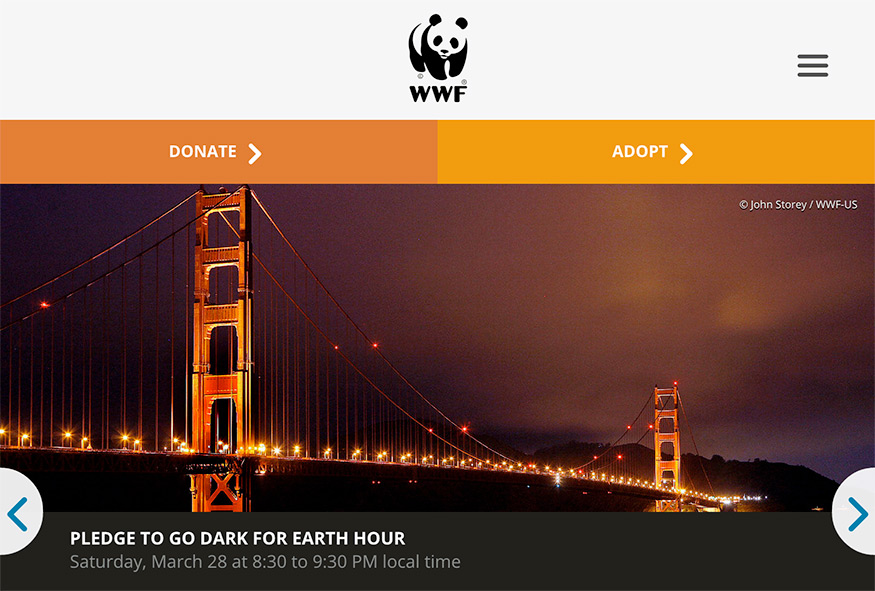
World Wildlife Foundation
VISIT SITE
World Wildlife Fund’s two biggest needs are adoption and donations. You’ll notice these two areas of the site are called out in the main navigation at every size.
ParentSavvy

VISIT SITE
Of course we had to include one of our own! From desktop to tablet to phone, Parentsavvy.com is fully responsive. Establishing an effective information hierarchy will determine the flow of the elements on the page when it comes to their arrangement on smaller screens.
AWWWARDS
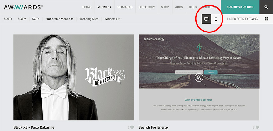
VISIT SITE
I put this on the list, not simply because it is responsive, but also because of the helpful search filter that can be applied to view sites by device. This gives you a quick preview of how sites are displayed between desktop and mobile views.