Outgrowing an old brand.
Established in 2002, Bit Perfection (originally Door-2-Door Computer Services) outgrew their brand and wanted a more sophisticated brand identity that communicated their core strengths and would position their company for future growth.
The smallest unit of data — a Bit — inspired the company name. The digital world builds from this very minute detail. The attention to detail is what sets Bit Perfection apart from their competition. We set out to design a strong, yet easy to recognize logo and unique color palette that visually separates Bit Perfection from other Managed IT Service Providers in Louisville, Kentucky.
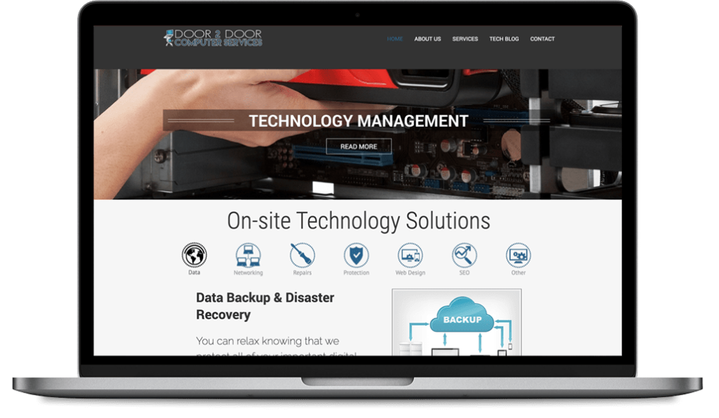
Previous Logo and Website
New Logo
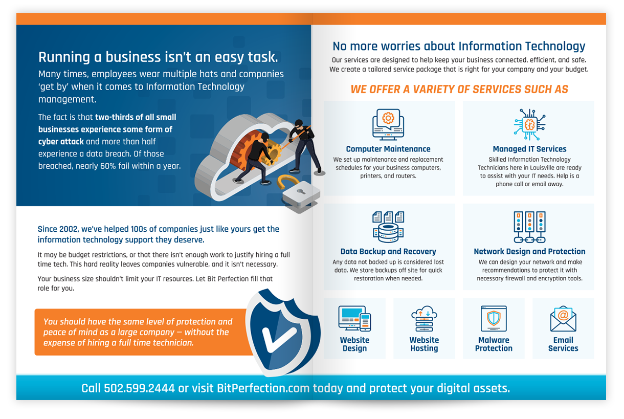
Collateral


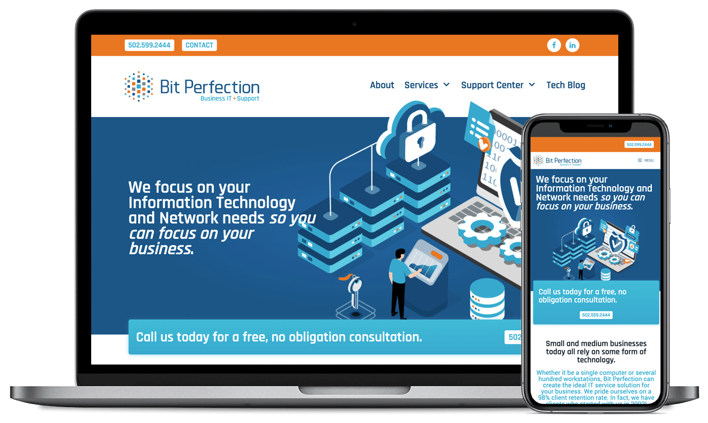
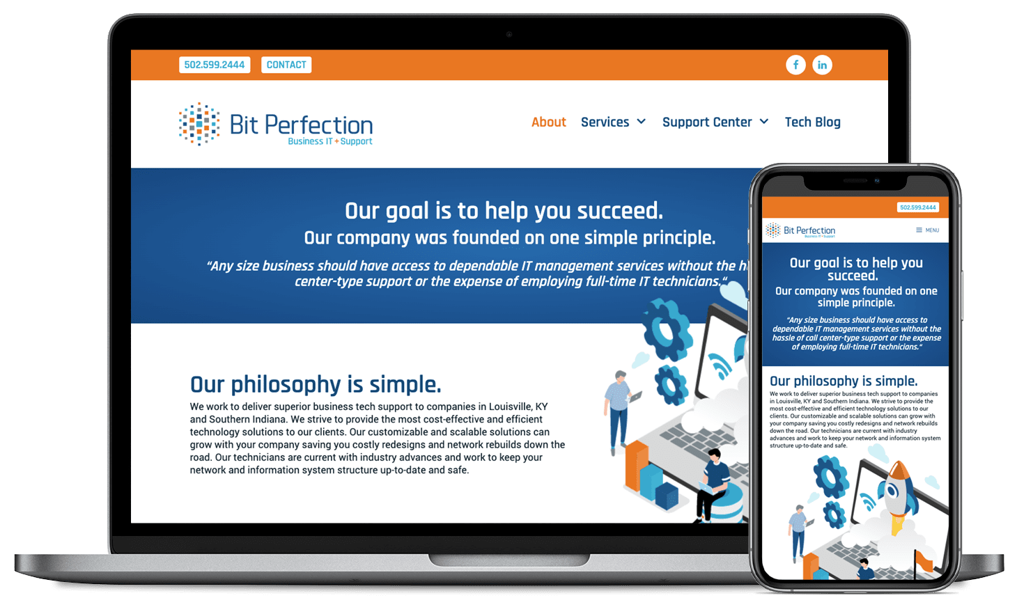
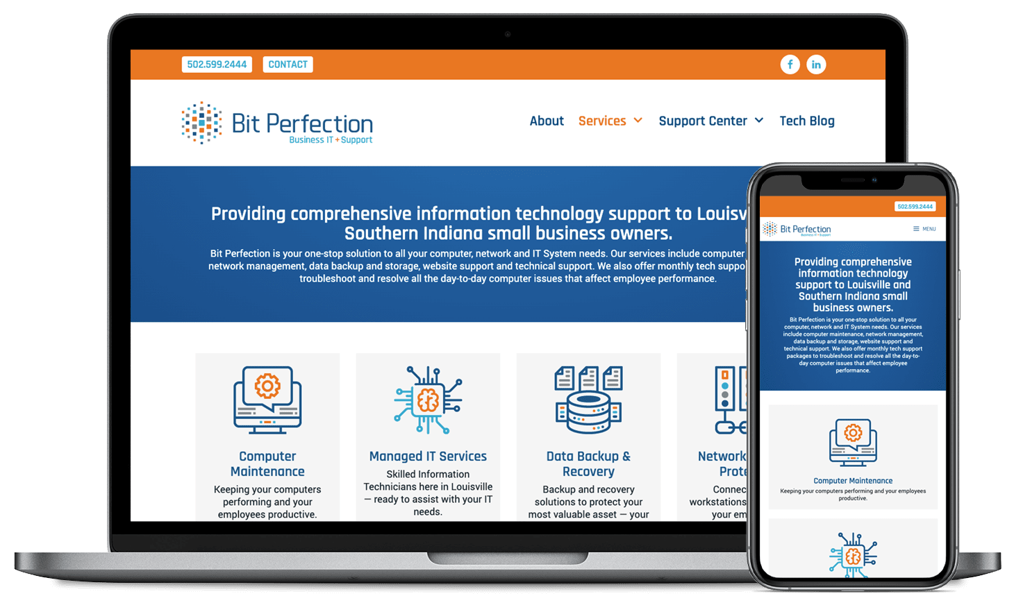
New Website
The client had specific requirements for their website. First, the design needed to stand out in the managed service industry. It also needed to showcase their services and position Bit Perfection as an authority in managed services in the Louisville metro area. We created a responsive WordPress website with a customized theme that supported organic and paid SEO.