
As part of Corporate 3 Design we help businesses create their brands and communicate their message to their target audience everyday.
But you know when you’re too close to something or you’ve been doing the same thing over and over again, you forget why you started in the first place. In one of our staff meetings, we started talking about our favorite brands, and we were reminded of why we started working in this business in the first place.
So in no particular order, here is our staff’s favorite brands and why they inspire us.
Levi’s
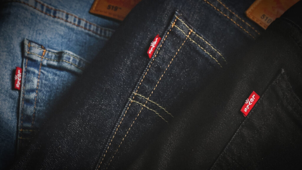
Throughout my entire life I have remained loyal to one brand. Only one brand.
The loyalty, you may think, was created by digital marketing messages, logo presentation, company values, production methods, sourcing selections, etc. In my case, loyalty to a brand is based on performance, consistency, reliability, comfort, availability, ease of use and low maintenance costs.
They fit right. They wear long. They fade perfectly.
I strayed from the Levi’s brand on very few occasions and when I did, I always returned to Levi’s consistency and quality I value. Other brands may fit in the initial try but over time…Levi’s remain the jean with the best ROI.
I value brands and products that do what they say they’re going to do. Status is useless, popularity is fickle, yet quality remains timeless.
Coca-Cola
Tim Thompson | Senior Account Executive
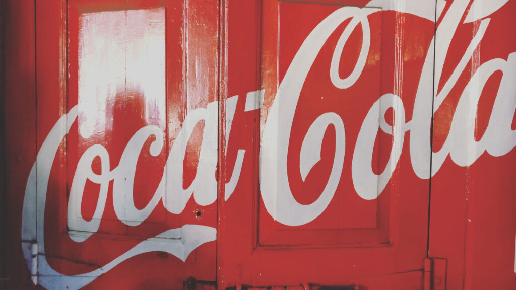
I have to go back to my old favorite, Coca-Cola.
There is an ongoing joke about Coke branding. If it moves, sponsor it, if it doesn’t move, paint it red.
When I see the trademark red and the script letters, it invites a visceral response. A warmth develops deep inside and surfaces as a smile. I recall fond childhood memories getting to take a sip of my grandparent’s soda. And I remember the right of passage when I graduated to having my own can of Coke!
The overall brand is reinforced in everything they do. Their creative and emotionally-charged commercials have strong visual ties to their logo—which frankly is everywhere. Even during a trip to Africa, I saw a Coca-cola sign a Mboga (grocery store) on the Serengeti!
Very little has changed regarding the overall design and structure of the Coca-cola logo since 1887. The biggest change was in the 1940’s when the modern logo type was implemented to intentionally create consistent and recognizable visual identity.
I think the best summation of why Coke is my favorite brand is their slogan, “Have a Coke and a Smile.”
Teenage Engineering
Andrew Yolland | Web Developer
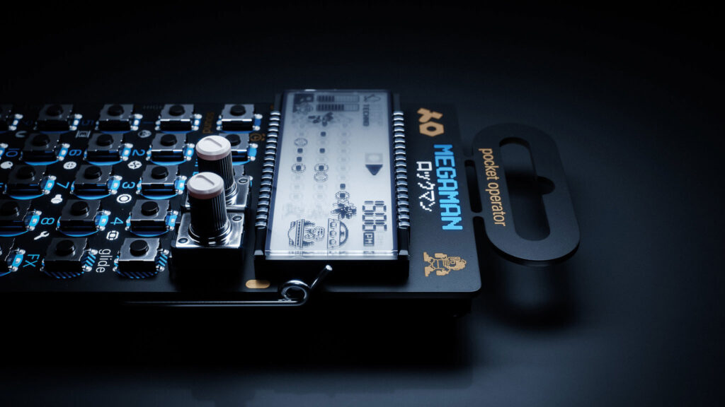
My favorite brand is Teenage Engineering. They took the very niche product of handheld drum machines and through clever, playful design and marketing made them so popular they border on mainstream now. The whole market surrounding low-end electronic musical instruments has expanded because of them. Their visual design sense is both fun and stylish, but most importantly their products are designed to be intuitive to use. Because the instruments they sell are so easy to pick up and create with, there’s many, many beginner creators out there producing video content that market the devices to other beginners. It creates this feedback loop between good word of mouth and the charming design of the products themselves.
Patagonia
Shawn Hartley | VP & Director – Digital Marketing
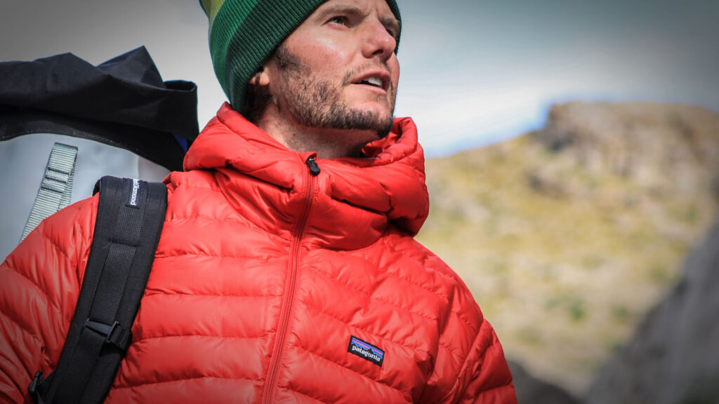
Patagonia is a clothing and outdoor lifestyle company.
From an ethical standpoint, Patagonia has recognized the failures of waste in mass production of consumer goods. They make sustainable choices to manufacturing products. They’ve invented recycling technology to turn plastic into fleece. They also build their products for the long haul and have a comprehensive repair program for their goods. They even sell used gear on their site.
The company also started a program called 1% For Planet and has pledged 1% of sales to the preservation and restoration of the natural environment. They are now approaching the $90 million mark for what they have given back.
The company has proven time and time again that corporate profitability can walk hand-in-hand with environmental sustainability.
Banner & Oak
Jeff Walker | Senior Account Executive
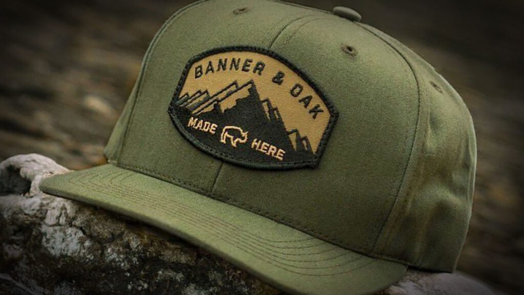
Banner & Oak is a brand I’ve come to know when Christmas shopping for my rugged son-in-law. He asked for a Banner & Oak hat, which I had never heard of. This is a small start-up in Arkansas that has earned a following as a brand associated with the great outdoors and adventure. Since ordering a hat, even though I am just a day hiker, I have found myself following their blog and social presence. Inspiring the adventurer in me, I can’t wait to explore on my next National Park vacation. I like the logo and voice. The website, blog and emails are clean and simple with good photography. They do not have a lot of product types yet, but what they do offer is top quality. I’ve received the hat and can verify everything was as promised.
Land Rover
Kathleen Troia | Graphic Designer
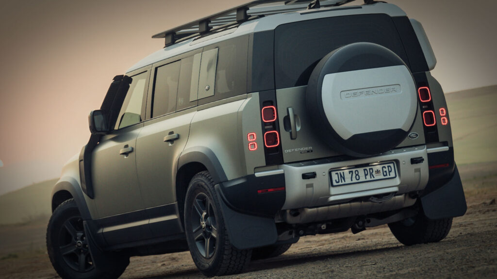
Recently the Land Rover campaign ads featuring John Mayer hit my Instagram feed. They must have found their way into my feed because I follow John Mayer, since I am clearly not the target market for these vehicles.
Still, the ads caught my attention and caused me to give the Land Rover site a look. I have always been a fan of the Land Rover brand from its logo to its vehicle design – they seem to marry rugged and elegance with ease. The Land Rover logo has been modernized over the years without changing much from its inception – helping to solidify its brand recognition. To me, the simple hunter green badge design seems to be a nod to the outdoors and Land Rover’s British roots – a logo that tells a story. The Land Rover website and collateral are clean, simple, and exude confidence – again ticking its brand’s boxes. Visually, Land Rover’s automotive design and paint-color choices fall perfectly in line with its brand and its audience – adventurous, luxurious, capable, and attention-grabbing.
Smart and expensive – Land Rover knows exactly who they are (they just don’t realize that I can’t afford their cars) even though it might be the perfect car camping vehicle.
HyVee
Carolyn Kruger | Digital Strategist
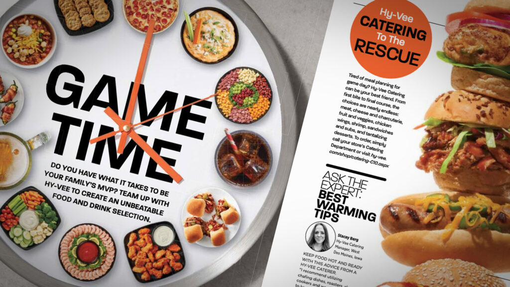
I admire HyVee’s brand because of their inventive nature in an industry that has had to make changes to stay competitive. They’ve kept their hometown values that built their business while continuing to grow and serve customers in unique ways. From having clinics and pharmacists in their grocery store, to offering a full fresh meat counter, and providing a selection of options for health food needs to making ordering online accessible and easy.
The logo and color has stayed pretty consistent throughout the years. I don’t love the typeface used for the logo, but it does signal consistency and longevity. As times have changed they’ve updated their advertising style. The photography and videography is modern and clean to show off the beauty of the food. Resulting in whetting the viewers appetite and drawing them into the store.
They’ve tested and experimented and grown a Midwest brand to something that rivals a large national brand.
BONUS
Apple
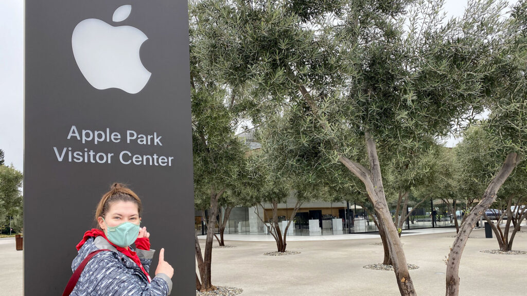
I can’t finish this post without talking about Apple. It’s one of the most talked about brands and for good reason. I’m a bit of an Apple fan girl. I wrote my high school senior paper about it. I studied design because I wanted to use Apple computers. I stood in line when our Omaha store opened. I visited the Cupertino Apple stores for my last birthday, and I bought t-shirts and mugs and took selfies like any fan would. In short, I have a problem.
The trajectory of the brand changed with the Think Different campaign in 1997 shortly after Steve Jobs took over a second time. He eliminated product lines so they could focus on just a few to make them great. Then he took how a human uses the tools into account and designed for them. This was unique for technology at the time, and in some cases, it’s still unique. I still think companies forget who the end user is.
With the invention of the iPod and the iPhone, they solidified their staying power. There are many people who will tell you there are other technologies that are superior and even Apple employees will tell you that there are better tools out there. That’s not the point. Their goal is to make simple, beautiful, easy-to-use hardware and software for real-life people.
Apple’s messaging and advertising is just as human focused. Apple doesn’t lead with the specs of the technology in their advertising; they lead with what us humans can use the technology for. Doing this leads to an emotional response and brand loyalty with consumers.
Narrative Marketing for the Win
Another way of explaining this is that Apple knows that narrative based marketing (where the consumer becomes the hero of the messaging instead of the business) is better for business long term. It creates loyalty and fans who will market for you. And as business owners, this is what any one of us wants.
Final final detail, I promise: Steve Jobs owned Pixar for a little while where he learned about storytelling from the geniuses running the company. Pixar was originally a piece of computer hardware; they created stories to help sell the product. The moral of this little rant about Apple: story sells.